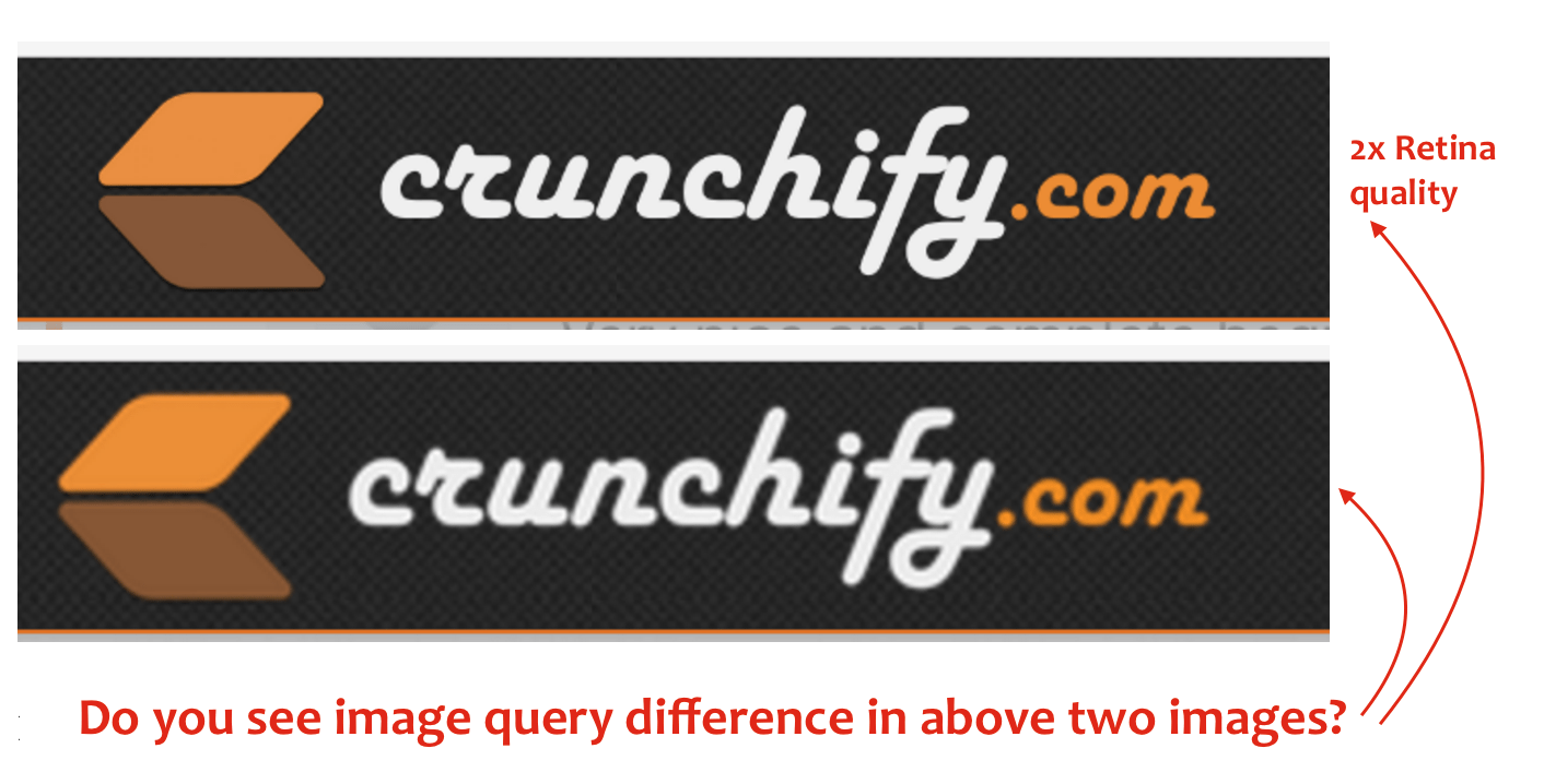
Do you see image query difference in above two images?
With all Retina Macbooks and high resolution displays around the world, nowadays it’s mandatory to have Retina Image for your WordPress Site header.
Non-retina display creates negative impression on readers.
With very simple CSS tricks you could achieve the same. Take a look at below simple tutorial:
Copy code and create new file retina-crunchify-tips.html. Open .html file into browser and checkout the result.
<!DOCTYPE html>
<html>
   <head>
      <title>Crunchify Tips on How to include Retina Logo to your WordPress theme</title>
      <link rel="stylesheet" type="text/css" href="crunchify.css">
      <style>
         .high-resolution-photo {
             background-image: url('https://crunchify.com/wp-content/icon/crunchify.com@2x.png');
         	 background-size: 274px 65px;
	         background-repeat: no-repeat;
	         display: block;
    	     width: 274px;
        	 height: 65px;
         }
         .normal-photo{
	         background-image: url('https://crunchify.com/wp-content/icon/crunchify.com.png');
    	     width: 274px;
        	 height: 65px;
         }
      </style>
   </head>
   <body>
      <div class="high-resolution-photo"></div>
      <br>
      <div class="normal-photo"></div>
   </body>
</html>
If you use images as CSS background you can use the background-size property of CSS3 to downsample the image for non-retina devices.
On Crunchify.com we are using Genesis WordPress framework. We have made below changes make it work. For all other standard WordPress installation, we will create new tutorial within couple of day. So please stay tuned.
Let’s get started:
Step-1
If your logo size is 130x65 px then create logo image with double size 260x130 px.
StandardDisplay Logo: crunchify.com.pngRetinaDisplay Logo: crunchify.com@2x.png
Step-2
Add below code to functions.php file
//* Add support for custom header
//* Will display at 130x65 (Genesis)

add_theme_support( 'custom-header', array(
	'width'           => 260,
	'height'          => 130,
	'header-selector' => '.site-title a',
	'header-text'     => false
) );
Step-3
Add below CSS code to style.css file. Provide absolute path of your logo in below code.
@media
only screen and (-webkit-min-device-pixel-ratio: 2),
only screen and (   min--moz-device-pixel-ratio: 2),
only screen and (     -o-min-device-pixel-ratio: 2/1),
only screen and (        min-device-pixel-ratio: 2),
only screen and (                min-resolution: 192dpi),
only screen and (                min-resolution: 2dppx) {
.header-image .site-title > a {
        float: left;
        min-height: 130px;
        width: 100%;
        background: url(images/crunchify@2x.png) no-repeat left top !important;
        background-size: 130px 65px !important;
}

.header-image .title-area,
.header-image .site-title,
.header-image .site-title a {
    max-width: 130px;
    min-height: 65px;
    padding: 0;
    width: 100%;
    float: left;
    margin: 0;
}
you might have to adjust the min-height and width rule on the title-area and site-title rule: set the min-height to the same height as your standard logo height.
Step-4
Clean your site’s cache and reload your blog.