Mobile Usability is a big word now. On April 21st, 2015 Google has updated their Search Algorithm which include Mobile usability as one of the search criteria. If your site is not mobile friendly then there are chances your mobile search traffic is going to get affected by this change.
At Crunchify we also fixed few issues to become site fully compliance with mobile friendly requirements. Idea for this post is to share steps which I followed in order to fix those issues at Crunchify. For me this is as important as I keep my site’s speed loading super fast.
Let’s get started:
Point-1) How to check if your site has any mobile usability related error?
Step-1
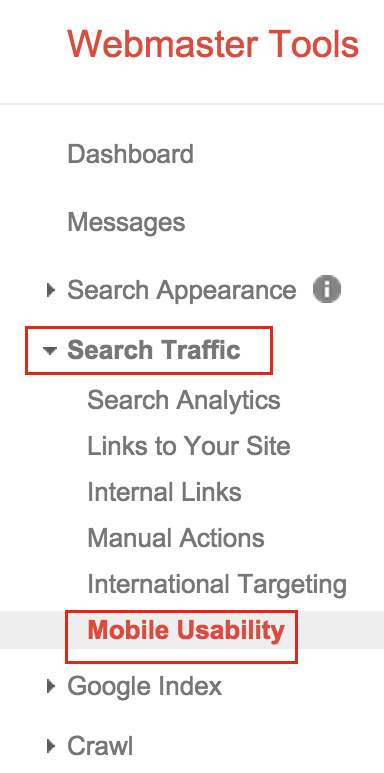
- Go to Google Webmaster tool
- Select your site
- Click on
Search Traffic - Click on
Mobile UsabilityLink
Step-2
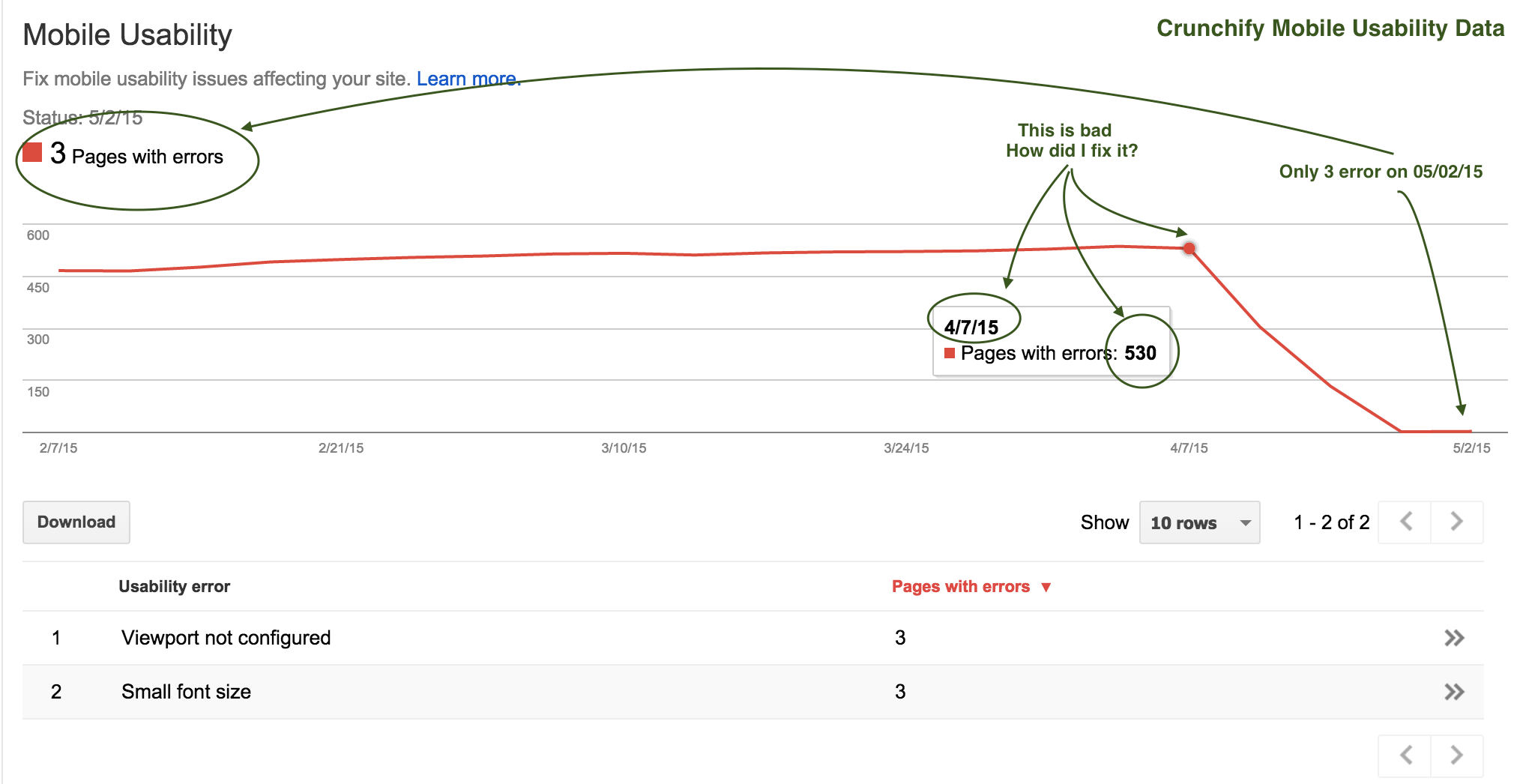
You should see your site’s Mobile Usability report like at the of this page. At the bottom of report you should see the reason too.
Point-2) How to Fix error?
In my case there were two issues.
- Touch elements too close
- resources which are blocked by robots.txt
How to fix Touch Element too close error?
In my case header elements were too close. I’ve just changed CSS to below one which worked and helped me fix this error.
.genesis-nav-menu a {
  border: none;
  color: #fff;
  display: block;
  padding: 24px 18px;  <== this was 14px 12px;
  position: relative;
}
These tap targets should be at least 7mm (48 CSS pixels if you have configured your viewport properly), and should have additional spacing around them if they are any smaller than 7mm.
How did I fix blocked resource error in robots.txt?
Below robots.txt file content will self explain you the same. I was blocking all .js and .css files which resides in wp-content folder.
Before:
User-agent: *
Disallow: /wp-admin/
Disallow: /wp-content/
Disallow: /wp-includes/
Disallow: /refer/

Sitemap: https://crunchify.com/sitemap_index.xml
After:
User-agent: *
Disallow: /refer/

Sitemap: https://crunchify.com/sitemap_index.xml
Point-3) How to Test result?
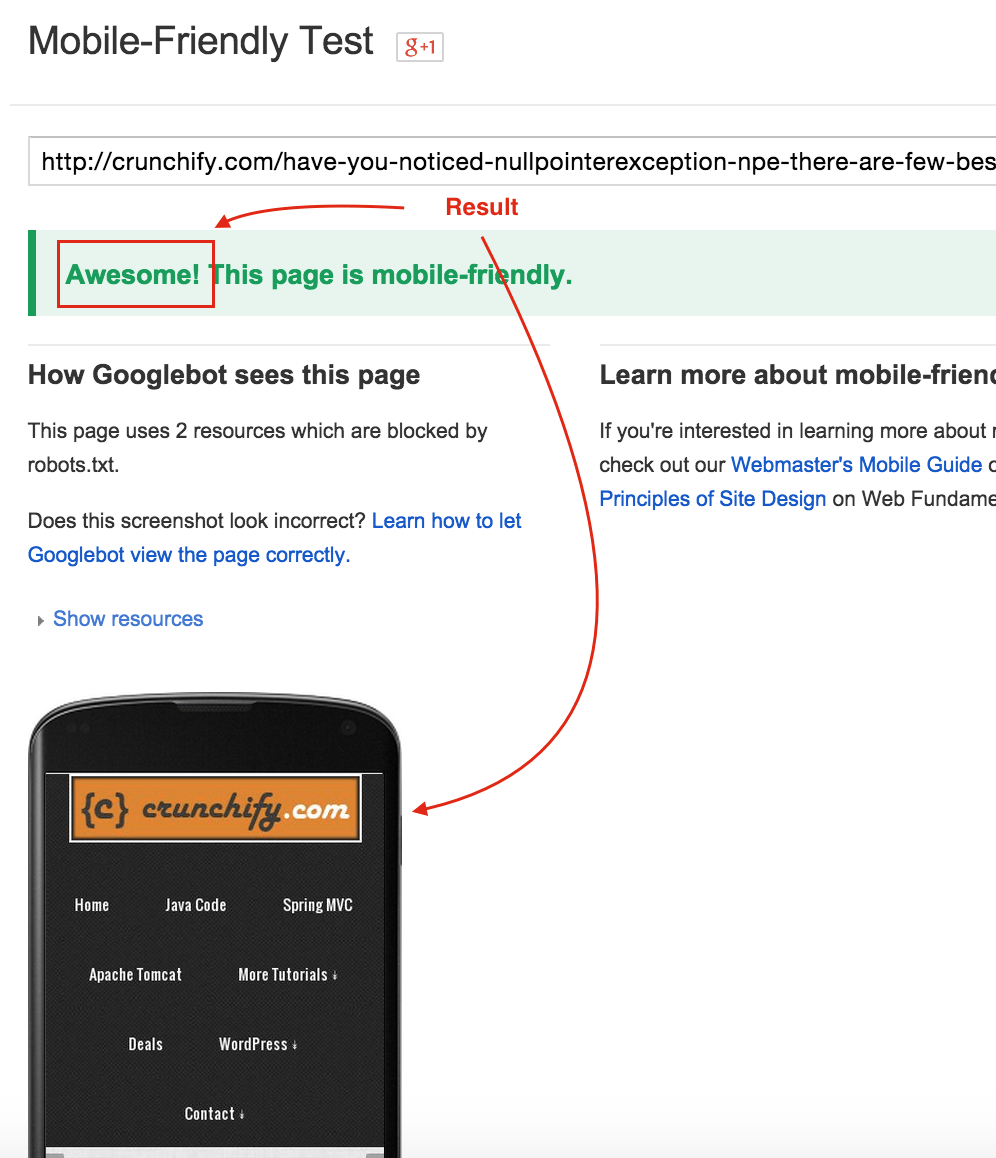
Step-1
Visit url: https://www.google.com/webmasters/tools/mobile-friendly/. Enter your blog URL and you should see Failed or Awesome result.
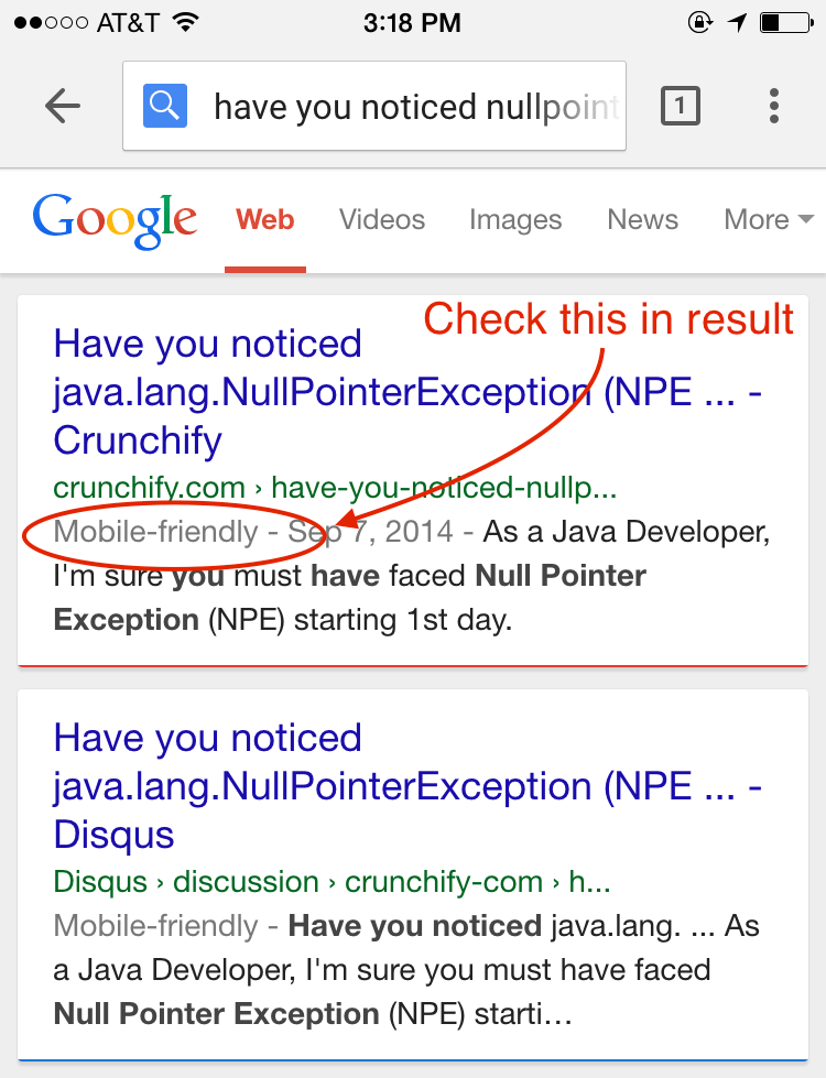
Step-2
Visit any browser and search for your site post. You should see Mobile-friend in front of blog post. If it’s there your SERP ranking will not be affected by this new Google’s algorithm change.