Twitter today rolls out new Web user interface with bunch of changes.
So far we are loving the new design. It’s pretty neat and clean now with only 2 columns layout. Micro blogging site has been making changes to site layout since beginning. I would say, this change is a replica of Mobile version of Twitter.
Layout out is now perfectly matching with Mobile version of site.
#NewTwitter layout now also supports quick keyboard shortcuts and now more provides easy layout to read and send tweets. I also noticed new trending section and new search page with lots of details.


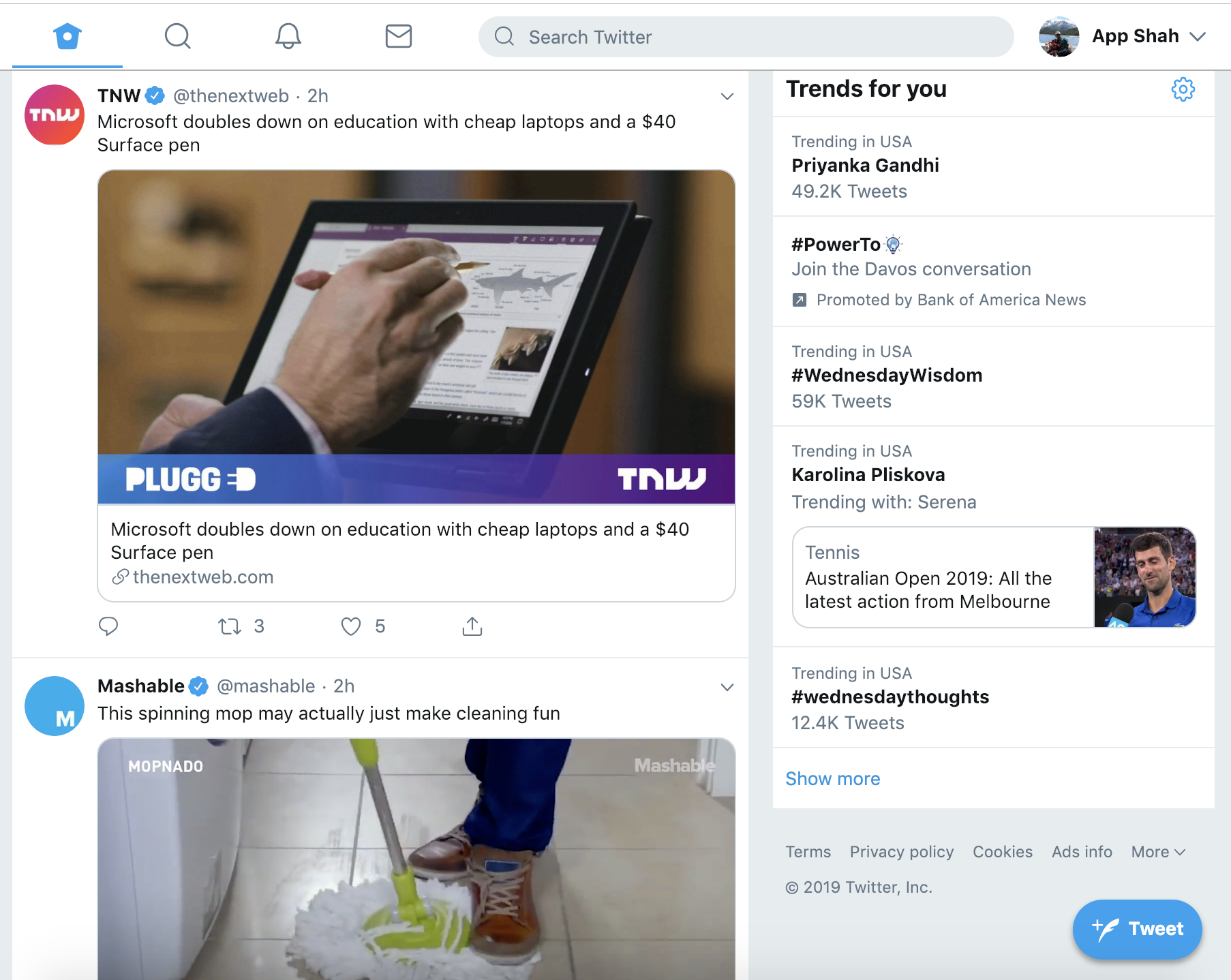
Here are the key differences between new and old twitter web interface:
- Two columns layout
- Tweet Button moved to
bottom right corner - Clicking on Profile name hovers new slick setting menu
- Mega profile banner is gone now. It fits now in left sidebar section
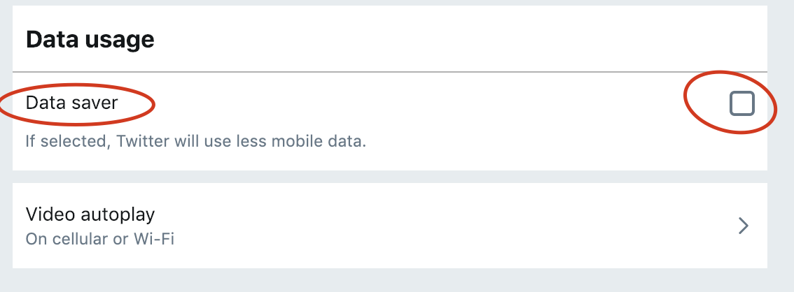
- Simple
Dark Modeoption and Data Saver Option in sidebar - New Emoji section
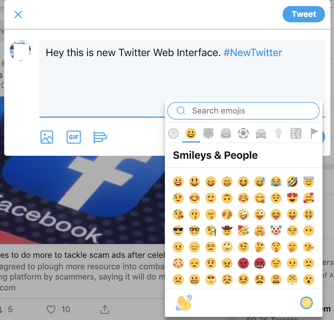
- New Compose section

Here is a new Twitter compose section.
So far it’s all good. Let me know your comment about new Twitter via comment section.