Let’s create a Sticky Sidebar Widget that Scrolls With your screen.
Hello Bar is a fun, unobtrusive yet highly visible web toolbar that sits at the top of your website and is a great way to engage users.
I used Hello Bar FREE version for a day to display currently trending post and today I got an email from them — You’ve completed Level 1 of Hello Bar!

Even though they have very nice Premium feature, I’m not quite ready for it. So, I thought of having Sticky Sidebar "Trending Now" section on my blog.
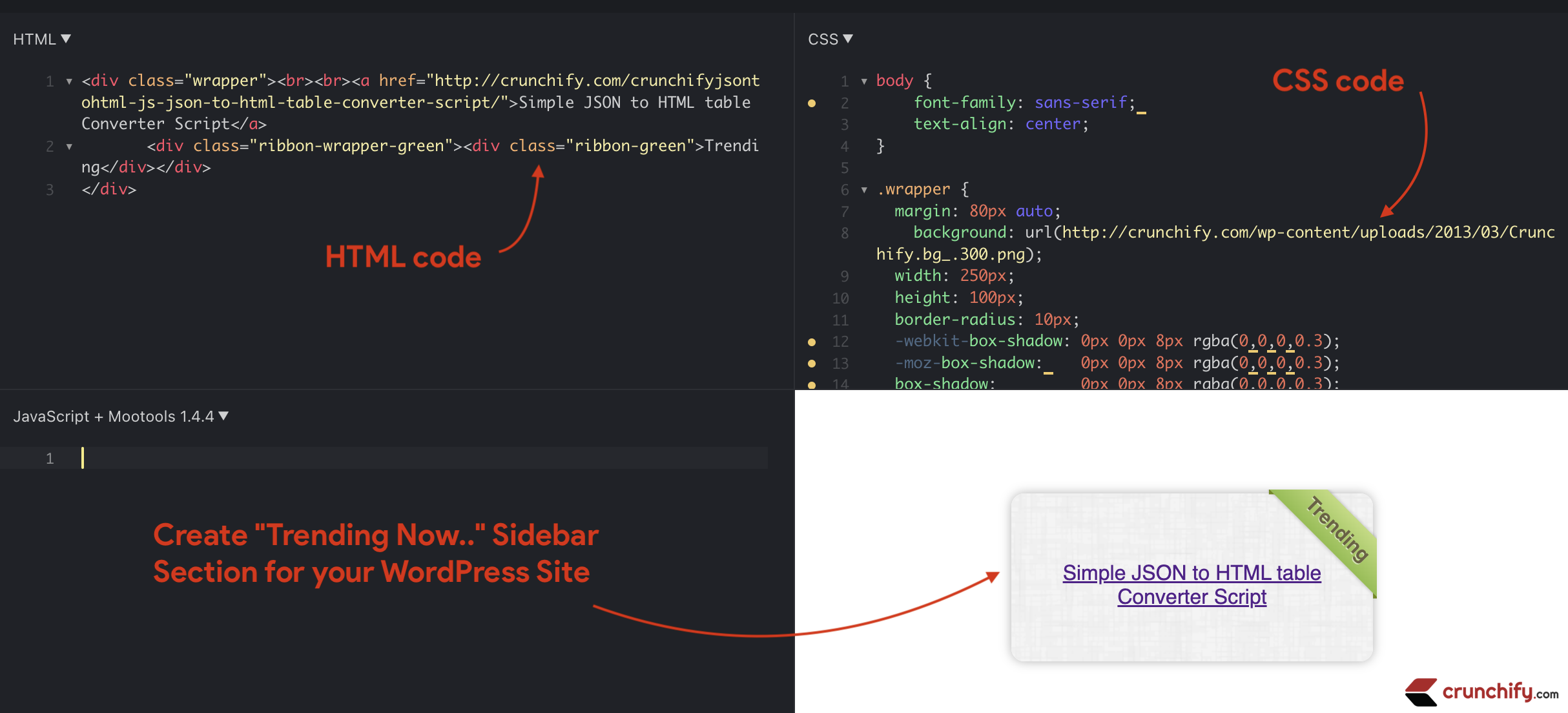
If any one of you interested in having sample sticky section in your WordPress sidebar then simply use below code and you should be all set.
Other must read:
- I choose BitBucket over Github for my Pro WordPress Plugins. Why?
- How to Secure your WordPress Plugin? Prevent CSRF Vulnerability
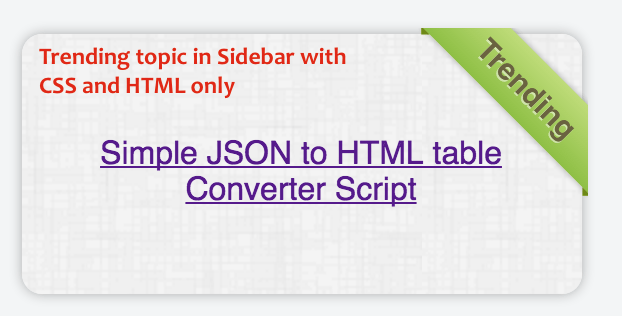
Sample screenshot:
This trending section will stay and scroll with your browser scroll 🙂

Put below into your WordPress theme’s style.css file
Simply copy and paste below code and put it in style.css file.
.wrapper {
  margin: 20px auto;
  background: url(https://crunchify.com/<some bg image file>.png);
  width: 214px;
  height: 90px;
  border-radius: 10px;
  -webkit-box-shadow: 0px 0px 8px rgba(0,0,0,0.3);
  -moz-box-shadow:    0px 0px 8px rgba(0,0,0,0.3);
  box-shadow:         0px 0px 8px rgba(0,0,0,0.3);
  position: relative;
  z-index: 90;
  padding: 0px 15px;
}

.ribbon-wrapper-green {
  width: 85px;
  height: 88px;
  overflow: hidden;
  position: absolute;
  top: -3px;
  right: -3px;
}

.ribbon-green {
  font: bold 15px Sans-Serif;
  color: #333;
  text-align: center;
  text-shadow: rgba(255,255,255,0.5) 0px 1px 0px;
  -webkit-transform: rotate(45deg);
  -moz-transform:    rotate(45deg);
  -ms-transform:     rotate(45deg);
  -o-transform:      rotate(45deg);
  position: relative;
  padding: 7px 0;
  left: -5px;
  top: 15px;
  width: 120px;
  background-color: #BFDC7A;
  background-image: -webkit-gradient(linear, left top, left bottom, from(#BFDC7A), to(#8EBF45));
  background-image: -webkit-linear-gradient(top, #BFDC7A, #8EBF45);
  background-image:    -moz-linear-gradient(top, #BFDC7A, #8EBF45);
  background-image:     -ms-linear-gradient(top, #BFDC7A, #8EBF45);
  background-image:      -o-linear-gradient(top, #BFDC7A, #8EBF45);
  color: #6a6340;
  -webkit-box-shadow: 0px 0px 3px rgba(0,0,0,0.3);
  -moz-box-shadow:    0px 0px 3px rgba(0,0,0,0.3);
  box-shadow:         0px 0px 3px rgba(0,0,0,0.3);
}

.ribbon-green:before, .ribbon-green:after {
  content: "";
  border-top:   3px solid #6e8900;
  border-left:  3px solid transparent;
  border-right: 3px solid transparent;
  position:absolute;
  bottom: -3px;
}

.ribbon-green:before {
  left: 0;
}
.ribbon-green:after {
  right: 0;
}
Go to Widget Section
- Create new widget section with below code:
<div class="wrapper">
<br>
<a href="https://crunchify.com/crunchifyjsontohtml-js-json-to-html-table-converter-script/">Simple JSON to HTML table Converter Script</a>
       <div class="ribbon-wrapper-green"><div class="ribbon-green">Trending</div></div>
</div>
Let me know if you see any issue with this and I’ll try to provide you an update in no time 🙂
Live example:
jsfiddle link: http://jsfiddle.net/H6rQ6/8540/
