
Have a question on how to add menu to discourse forum / add menu items to main discourse header area?
Recently I’ve added custom Navigation Headers to Crunchify Forum. Discourse.org forum is so far working perfectly fine. We have hosted forum on Linode hosting.
I wanted to have at least few links to my original blog on Crunchify Forum and decided to look around. I search around a lot and only solution I like which was on FeverBee forum. So I started implementing the similar menu and would like to share detailed steps with my readers.
- How to add header menu links
- Custom nav header like discourse.org
- Best way to customize the header for Discourse meta?
- How to add external link on top menu?
- Insert custom menu items within main nav
- Add Navigation header that takes you back to the parent site
This tutorial will help you if you have any of above questions too.
Let’s get started:
Step-1
- Go to your Forum’s admin page
- Click on
Customizebutton - Click on
CSS/HTMLbutton - Click on
Newand add yourpreferred Name
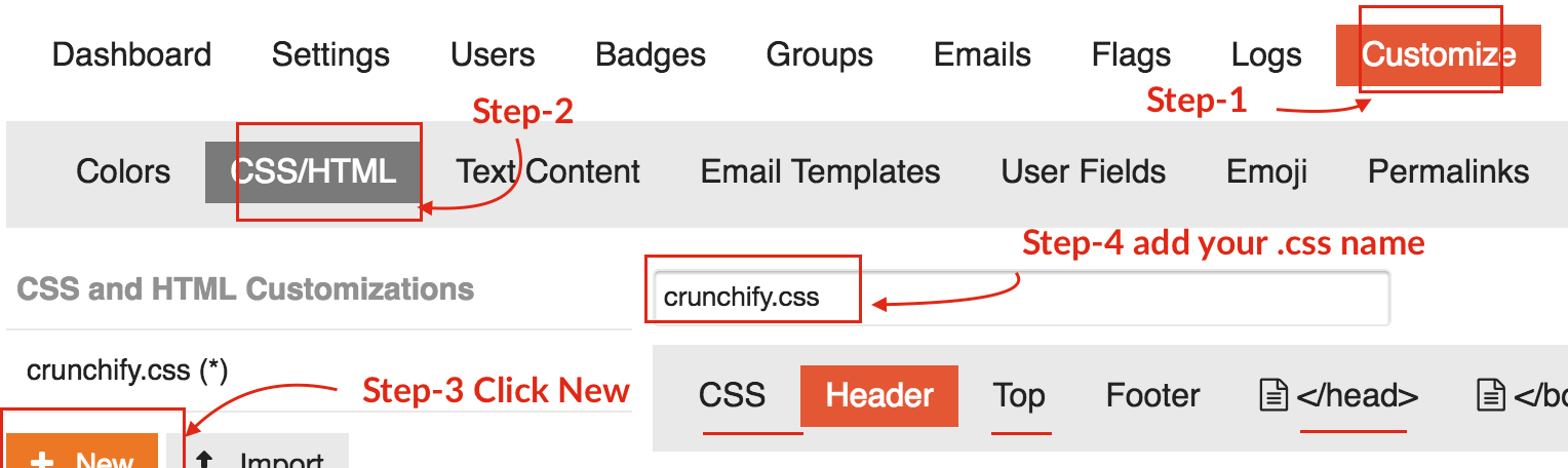
Step-2
Click on CSS tab and add below to CSS section.
This CSS will make sure to display menu header only on Desktop with min-width of 1024px. We are using @media CSS properties.
/* =============== Crunchify Header Menu CSS ================= */

// Hide header menu on mobile devices
@media screen and (max-width: 1024px) {
    .crunchify-container {
        display: none !important;
    }
}

// Show header menu only on desktop with size > 1024px
@media screen and (min-width: 1024px) {
    span#crunchify-top-links {
        display: block !important;
        margin: 10px 0 0 0;
    }
    div#crunchify-navbar {
        max-width: none;
        width: auto;
        z-index: 1040;
        position: fixed;
        top: 0;
        left: 38%;
    }
    .nav-link-container li {
        display: inline-block;
        float: left;
    }
    .nav-link-container a {
        color: rgb(255, 255, 255);
        text-decoration: none;
        text-align: center;
        line-height: 48px;
        font-size: 14px;
        padding: 0 1em;
    }
    .d-header .icons .icon {
        float: right;
        color: #EC7825;
    }
    .nav-link-container {
        display: inline
    }
}
Step-3
Click on Header section and add below code. Modify the links as per your need in below code block.
<div id="crunchify-navbar" class="crunchify-container">
<span id="crunchify-top-links">
<ul class="nav-link-container">
   <li><a href="https://crunchify.com" target="_blank" class="nav-link">BLOG</a></li>
   <li><a href="https://crunchify.com/category/java-tutorials/" target="_blank" class="nav-link">JAVA CODE</a></li>
   <li><a href="https://crunchify.com/category/spring-mvc/" target="_blank" class="nav-link">SPRING MVC</a></li>
   <li><a href="https://crunchify.com/wordpress-consulting/" target="_blank" class="nav-link">SERVICES</a></li>
   <li><a href="https://crunchify.com/contact/" target="_blank" class="nav-link">CONTACT</a></li>
</ul></span>
</div>
Step-4
Go to </Head> Section and add below code. This javascript will make sure that when your screen scrolled down to 120px it will hide Header Menu 🙂
<script>
$(window).scroll(function() {

    if ($(this).scrollTop() > 120)
     {
        $('.crunchify-container').fadeOut();
     }
    else
     {
      $('.crunchify-container').fadeIn();
     }
 });
</script>
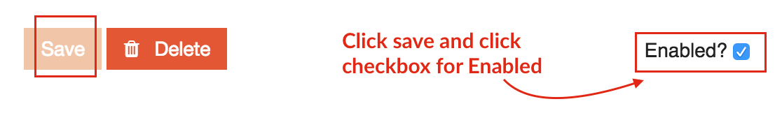
Step-5
Click Save button and click checkbox for Enabled option.
Just refresh your forum and you should see nice Navigation Header on your Forum.
Live Demo
Check it out Crunchify Forum: https://ask.crunchify.com.
This was my previous CSS code.
##CSS Code

/* =============== Crunchify Header Menu CSS ================= */
span#crunchify-top-links {
    display: block !important;
    margin: 24px 0 0 0;
}
.extra-info-wrapper .topic-link {
    max-width: 600px;
}
@media (min-width: 1150px) {
    .extra-info-wrapper .topic-link {
        max-width: 600px;
        padding-right: 250px;
    }
}
@media (max-width: 1149px) {
    div.title-wrapper {
        padding-right: 280px;
    }
}
@media (min-width: 999px) {
    div#crunchify-navbar {
        max-width: none;
        width: auto;
        z-index: 1040;
        position: fixed;
        top: 0;
        left: 58%;
    }
}
@media (max-width: 998px) {
    div.title-wrapper {
        padding-right: 220px;
    }
    span#crunchify-top-links {
        position: fixed;
        top: 0;
        margin: 22px 0px 0px -385px;
    }
    div#crunchify-navbar {
        max-width: none;
        width: auto;
        z-index: 1040;
        float: right;
        position: relative;
    }
}
@media (max-width: 900px) {
    div.title-wrapper {
        padding-right: 220px;
    }
}
@media (max-width: 725px) {
    a.crunchify-menu#library {
        display: none;
    }
    div.title-wrapper {
        padding-right: 135px;
    }
    span#crunchify-top-links {
        margin-left: -290px;
    }
}
@media (min-width: 571px) {
    i.fa.fa-home:before {
        display: none;
    }
}
@media (max-width: 570px) {
    a.crunchify-menu#store {
        display: none;
    }
    span#crunchify-top-links {
        margin: 19px 0 0 -220px;
    }
    i.fa.fa-home:before {
        display: initial !important;
        color: #FFF;
        font-size: 30px;
    }
    span#home-text {
        display: none;
    }
    div.title-wrapper {
        padding-right: 50px;
    }
    .extra-info-wrapper {
        display: block;
    }
}
@media (max-width: 455px) {
    .extra-info-wrapper {
        display: none;
    }
}
a.crunchify-menu {
    font-size: 14px;
    padding: 0px 12px 0px 0px;
    color: white;
}

.nav-link-container {
  display: inline;
}
.nav-link-container  li {
  display: inline-block;
  float: right;
}
.nav-link-container  a {
  color: rgb(255, 255, 255);
  text-decoration: none;
  text-align: center;
  font-family: 'Open Sans';
  line-height: 48px;
  min-width: 90px;
  font-size: 15px;
  padding: 0 1em;
}

.d-header .icons .icon {
     float: right;
    color: #EC7825;
}

.add-header-links {
    float: left;
    padding-left: 0;
}
Let me know if you face any issue running this code.